March 31st, 2020
For context on this:
Unlike February's skill, this one was a big success! Here's what I learned and some examples of how I applied this knowledge:
I learned how to be more consistent
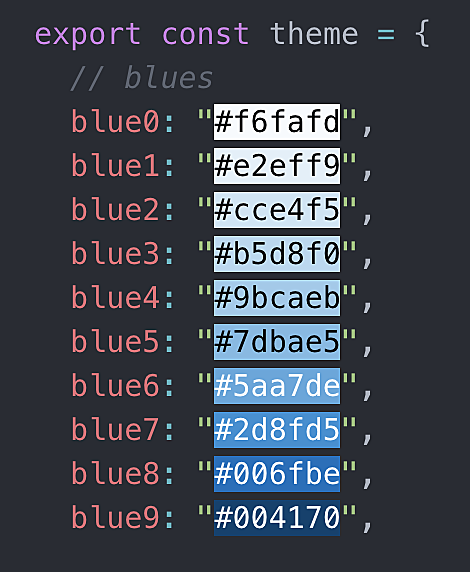
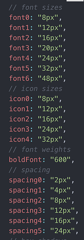
I learned about color palettes, well, I learned that it's a whole lot easier to use a scale for each color, this is how I have my CSS files set up now:
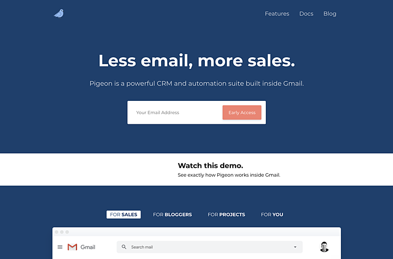
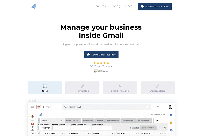
I redid the entire landing page for Pigeon:
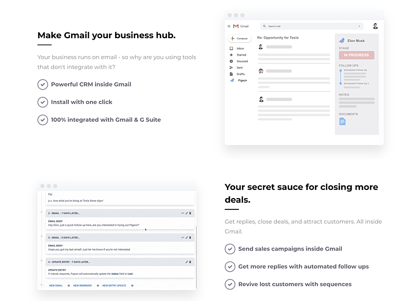
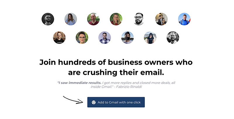
More screenshots from the new Pigeon landing page:
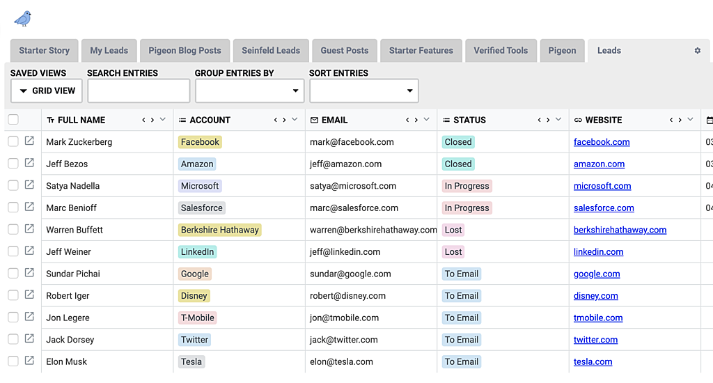
I added more color to the spreadsheet view, which makes things look sooooooo much nicer:
I also redid the sidebar for Pigeon: video.
Overall, here's my takeaways and some things I learned:
- Don't reinvent the wheel - what other (successful) sites are doing probably works, esp from a conversion perspective
- Design/UI is fun and it's just like coding - every day you get better and learn new tricks up your sleeve
- Use Dribbble for inspiration
- There is not very much good content out there on modern design
- Refactoring UI is the best money you'll ever spend
- ASK FOR FEEDBACK from people - it really helps.
Really stoked on this new "skill"! I'm not sure what my hobby will be for April. I will come up with it by tomorrow though!
